-
Category
Brand
-
Client
Subcode
-
My Role
Visual Designer
Subcode
Client: Subcode are a software engineering consultancy providing IT contractors specialising in web application development and service oriented architecture. They were a new start up so had no previous branding therefore needed a logo for their website, and also business cards/letter headings.
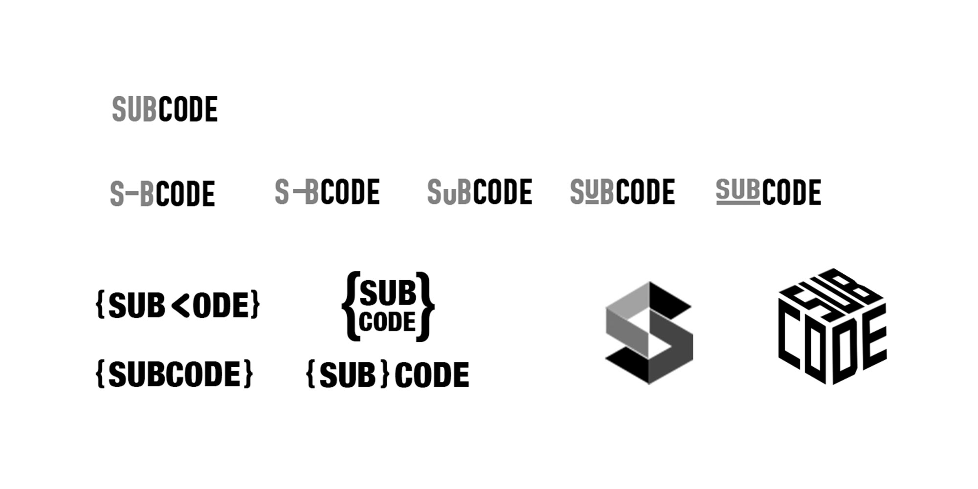
Design Thinking: These are some of the initial thinkings sent to the client after discussing their requirements with them. The company name has connotations of the software development industry that they are in therefore this was conveyed in many of the ideas with the use of brackets.
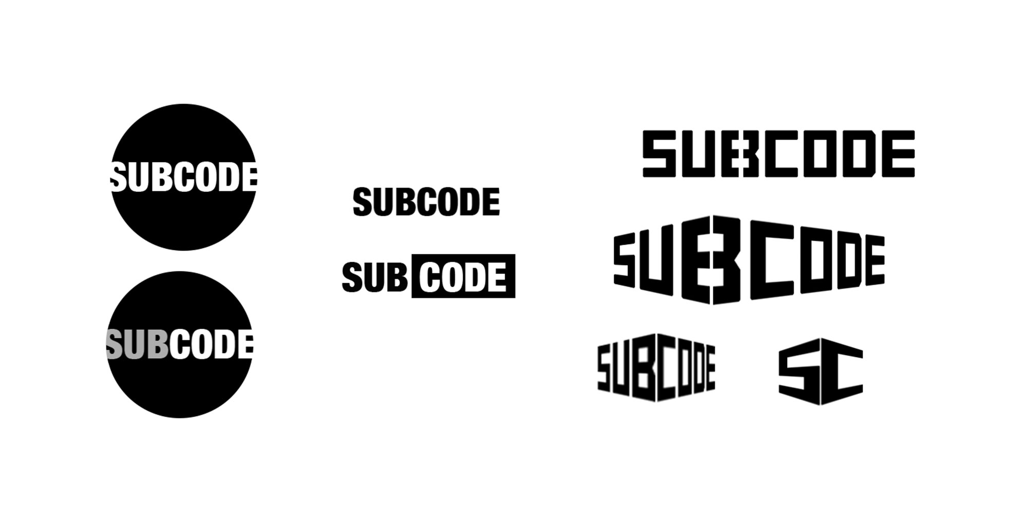
Design Thinking: Feedback was received on idea generation, the idea that suited their needs most was the simplest idea; bold and simple that stood out and also works at small sizes. The next step was choosing the correct font. Here are some of the variations created.
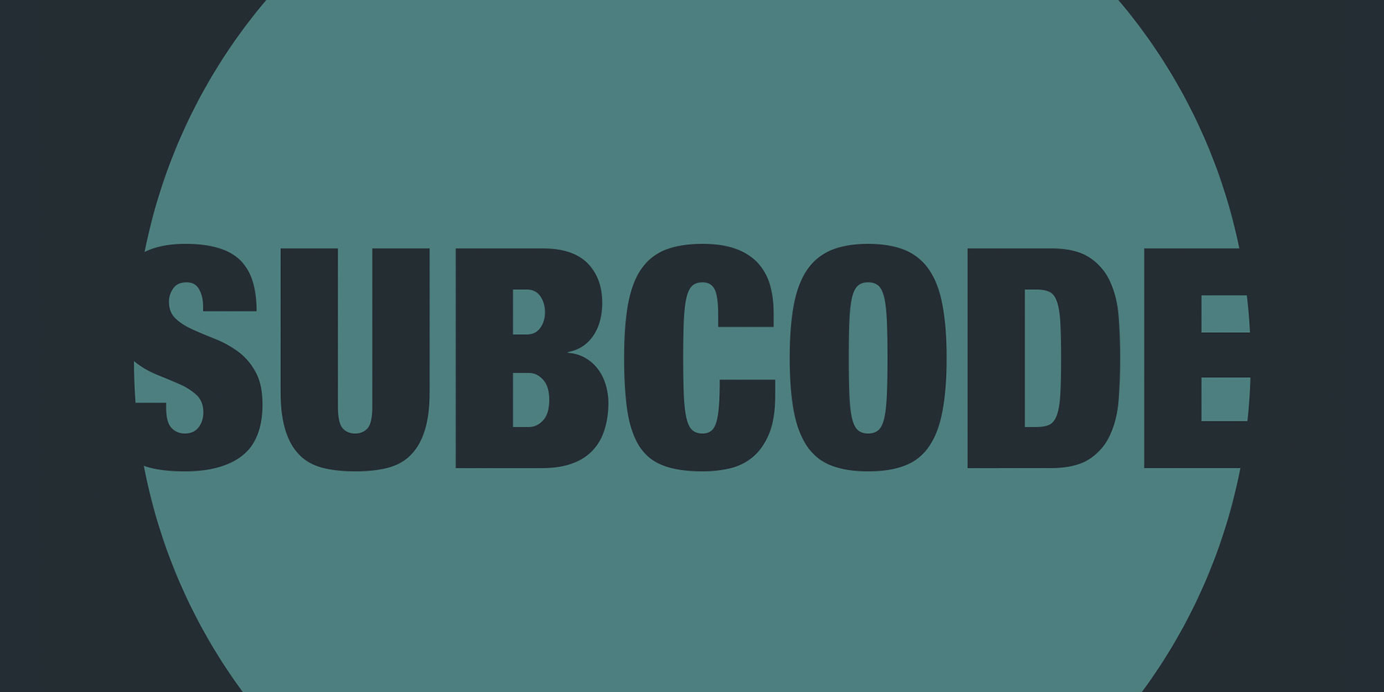
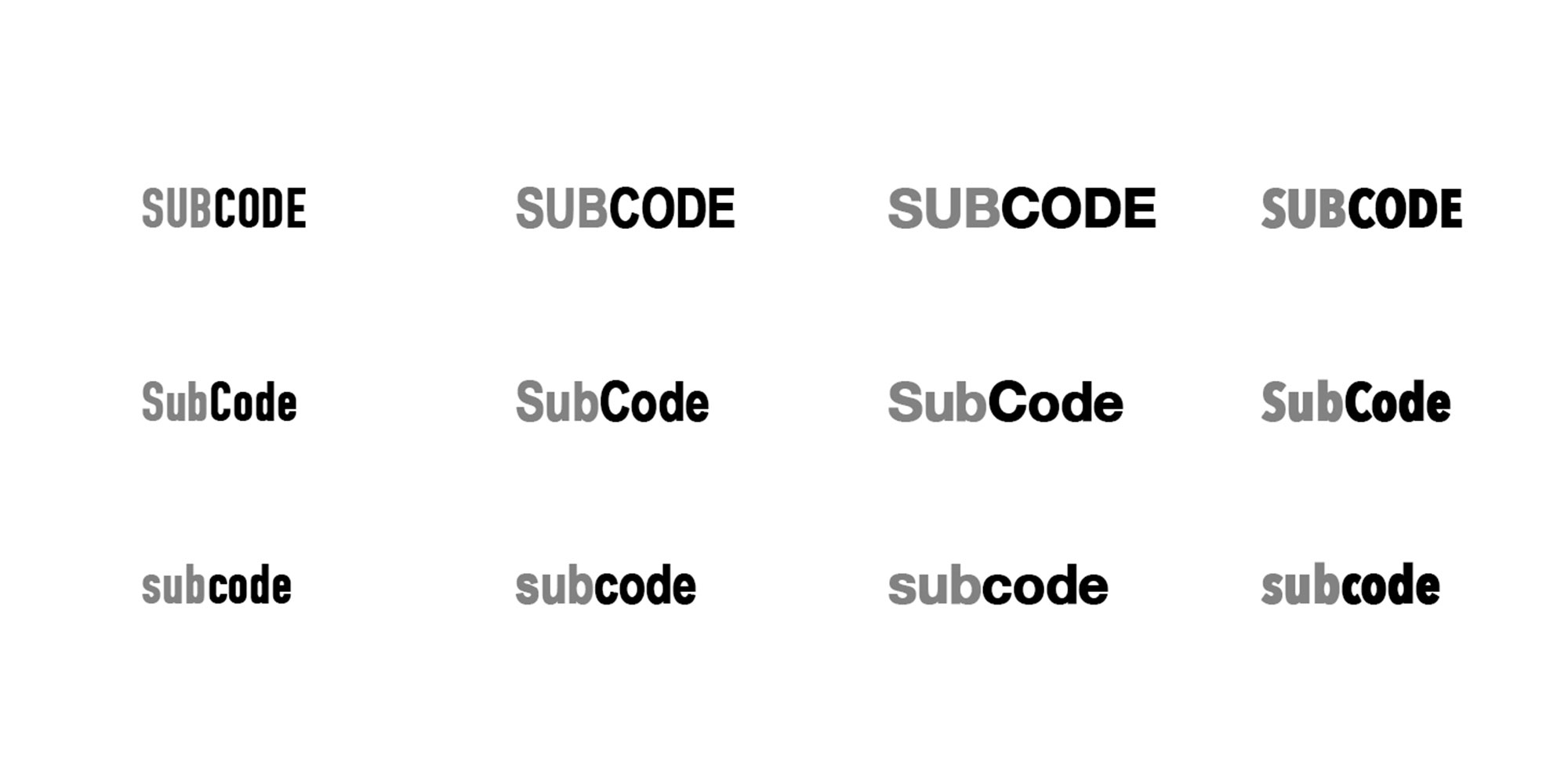
Design Thinking: It was decided to stick with a condensed sans serif font, as it acted best as a cut out, it was bolder and it complimented the shape of the circle.
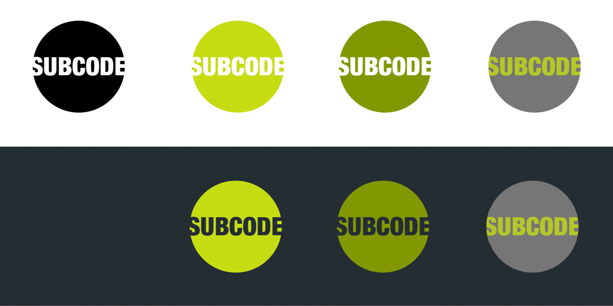
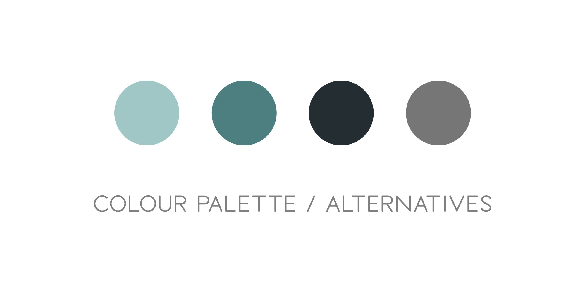
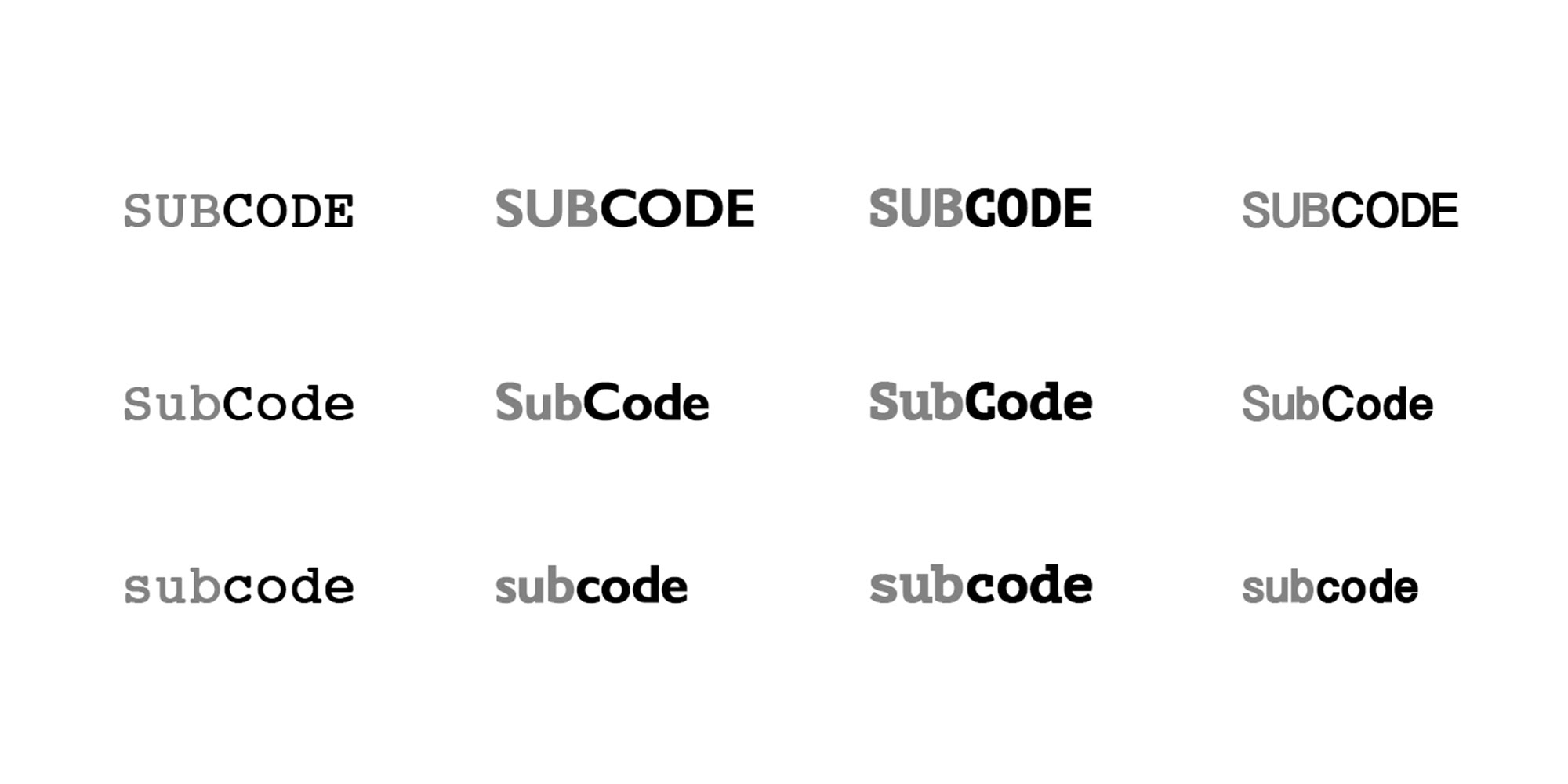
Design Thinking: The logo was trailed with a colour palette made from the colours in which the company suggested they’d liked to be associated with. I mocked up each logo on a light and dark background and as a transparent cut out or with a solid coloured text.
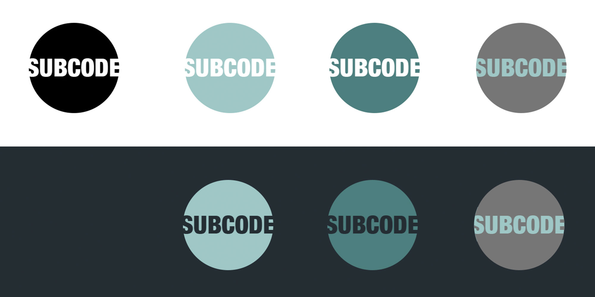
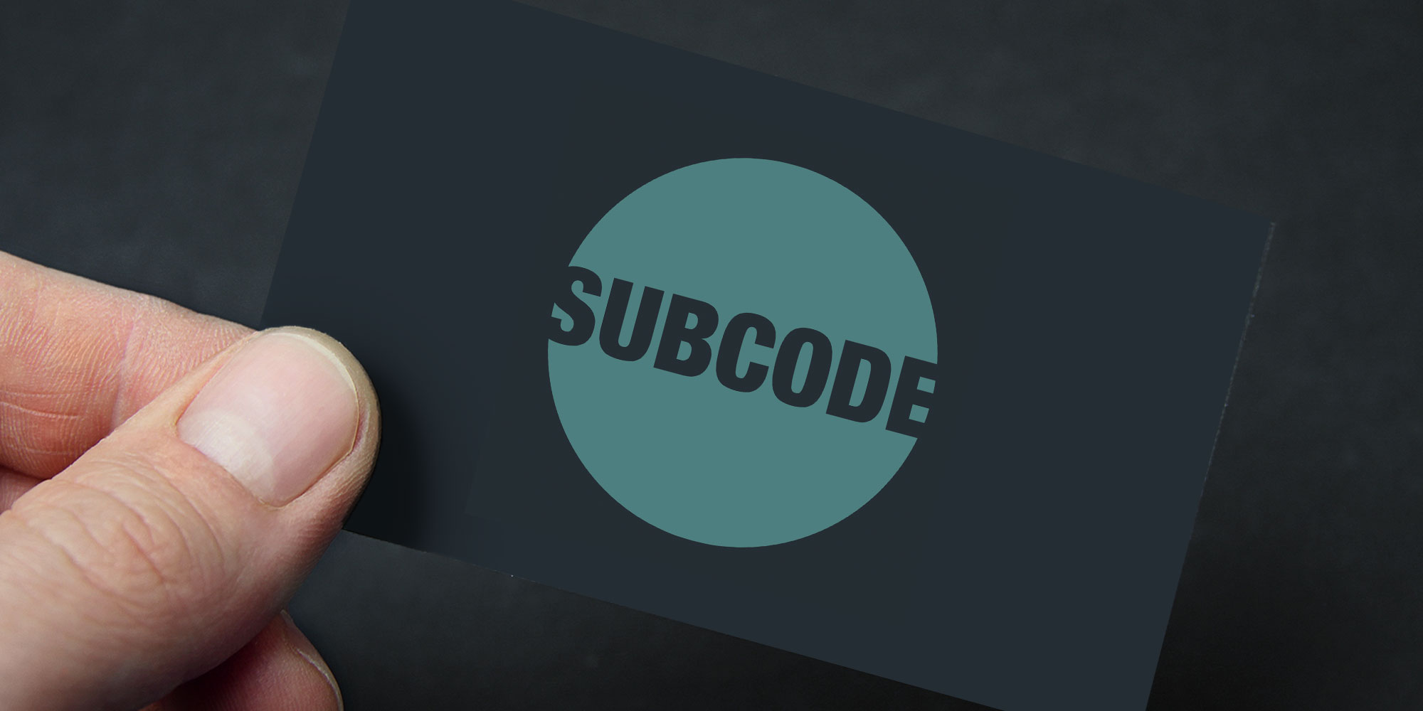
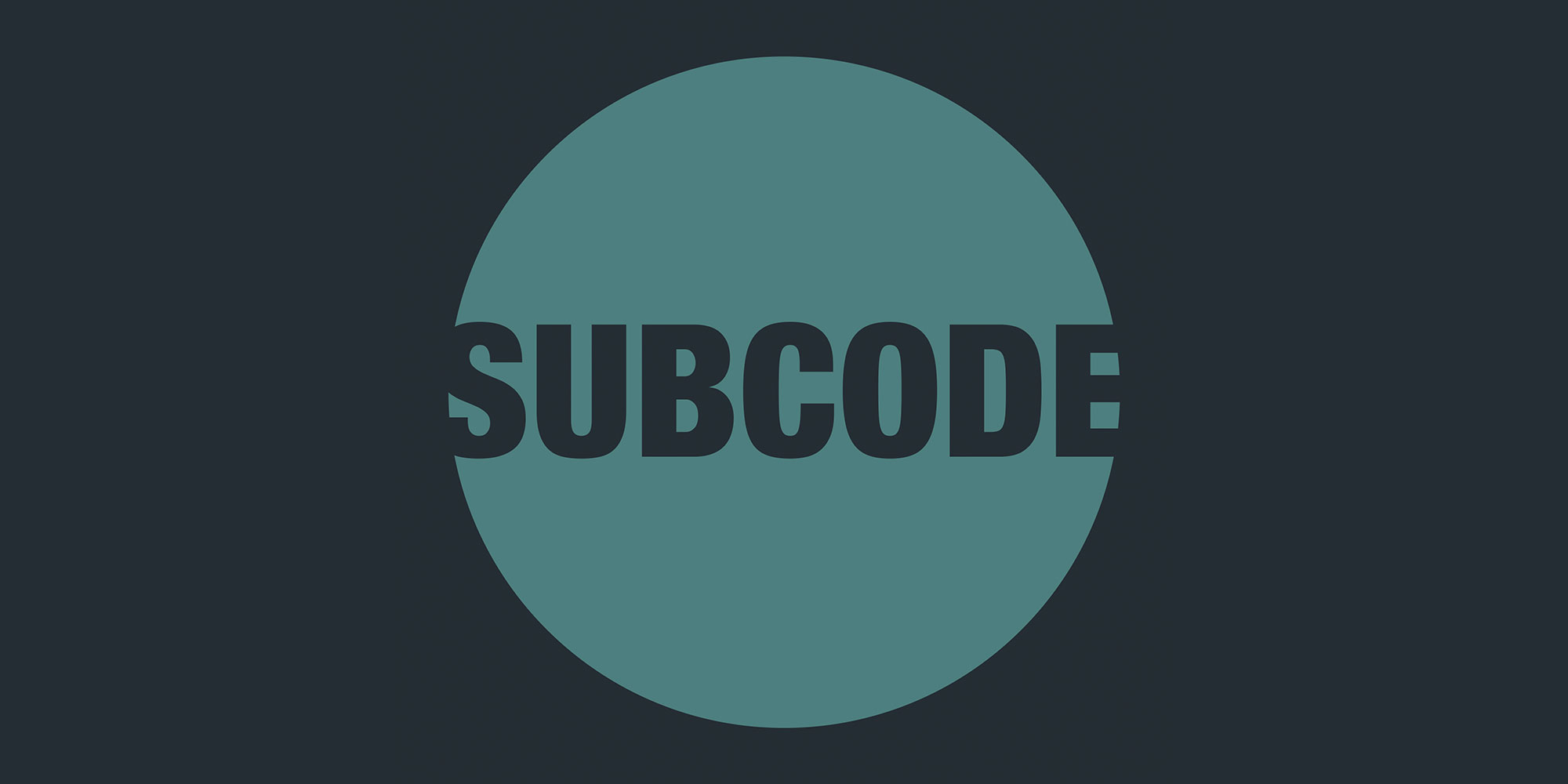
Final Design: The final logo chosen was the darker teal, with the text forming a transparent cut out so that the background colour comes through. Below are some examples of it in use.