-
Category
Brand
-
Client
Riverfox
-
My Role
Visual Designer
Riverfox
Client: Riverfox is my own brand in which I carry out any work completed out of my full-time employment hours. It currently consists of work done for either my own personal gain, or at requests of friends/family. I aspire in future to possibly grow this brand and produce print work for a wider audience.
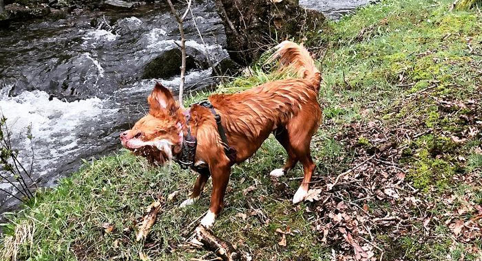
The name and branding of Riverfox comes from my dog and the time we spend together exploring. She’s a large part of my life and I wanted to include that in the branding without naming it after her completely. She’s a water dog and has the colourings of a fox, hence the name River Fox.
That's her having a real good shake in the photo, all ginger and white, like the fox in the logo.
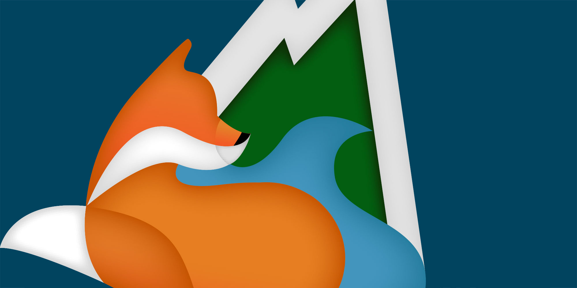
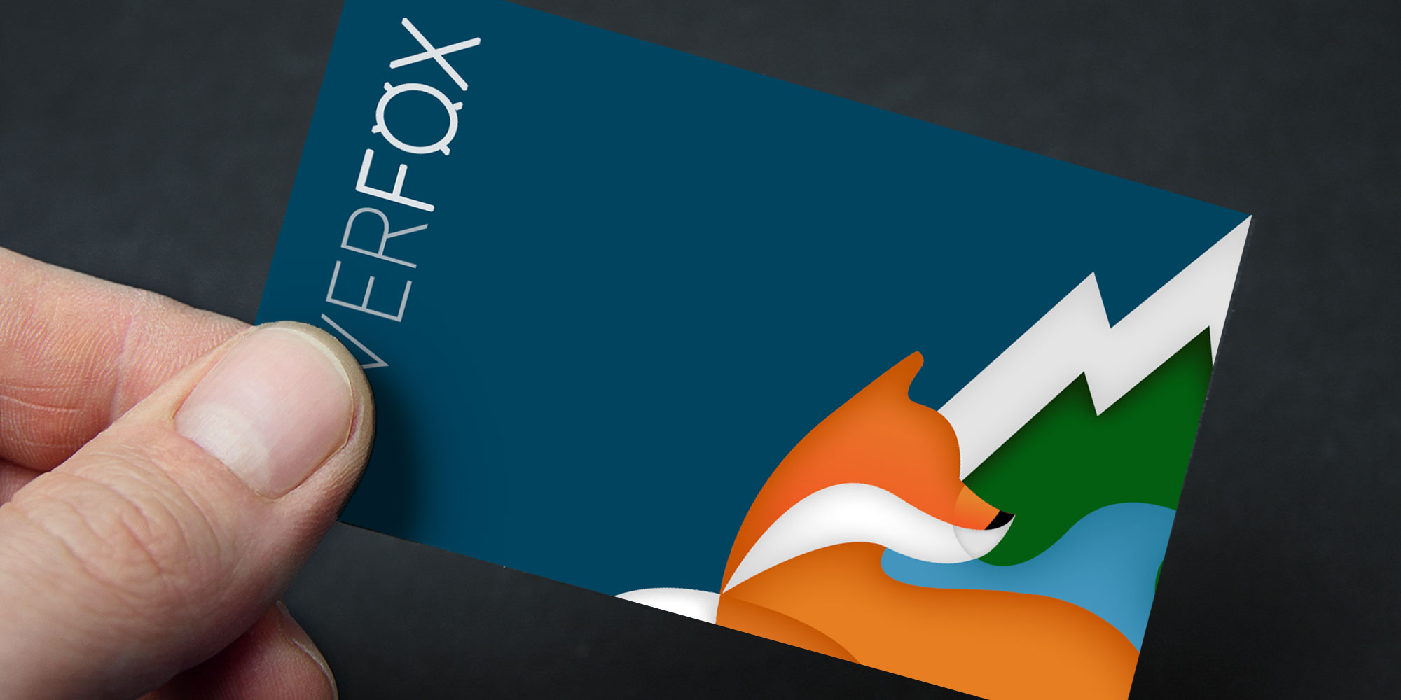
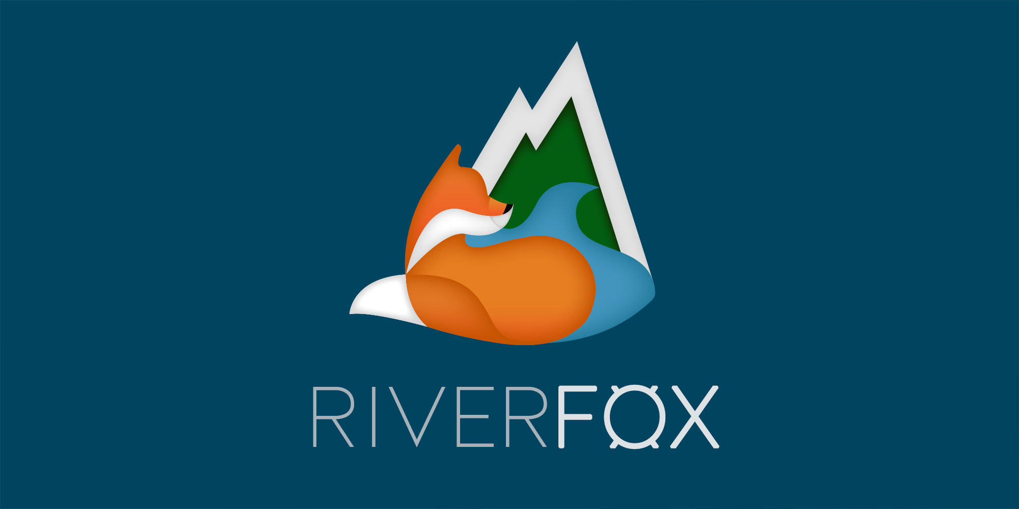
Design Thinking: The design includes a fox in front of a river, the fox is looking in the direction of the river, representing the brand name, and the shape of the river flows right through into the shape of the fox’s nose. Mountains are included as a connotation to the exploring we do, and also where the source of many rivers are found.
Design Thinking: The brand name has also been stylised, so that it can stand alone as its own identity in spaces that are either too small, or not suitable for the size/colour of the full logo design. The fox is the main focal point of the full colour logo, and therefore it should also be the main focal point of the written brand. This is achieved by the ‘X’ in fox being placed behind the ‘O’ to create a top and tail, making it stand out. The fox has also had faux bold applied to the font to increase its impact.
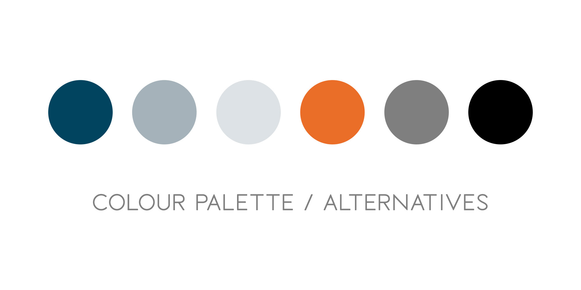
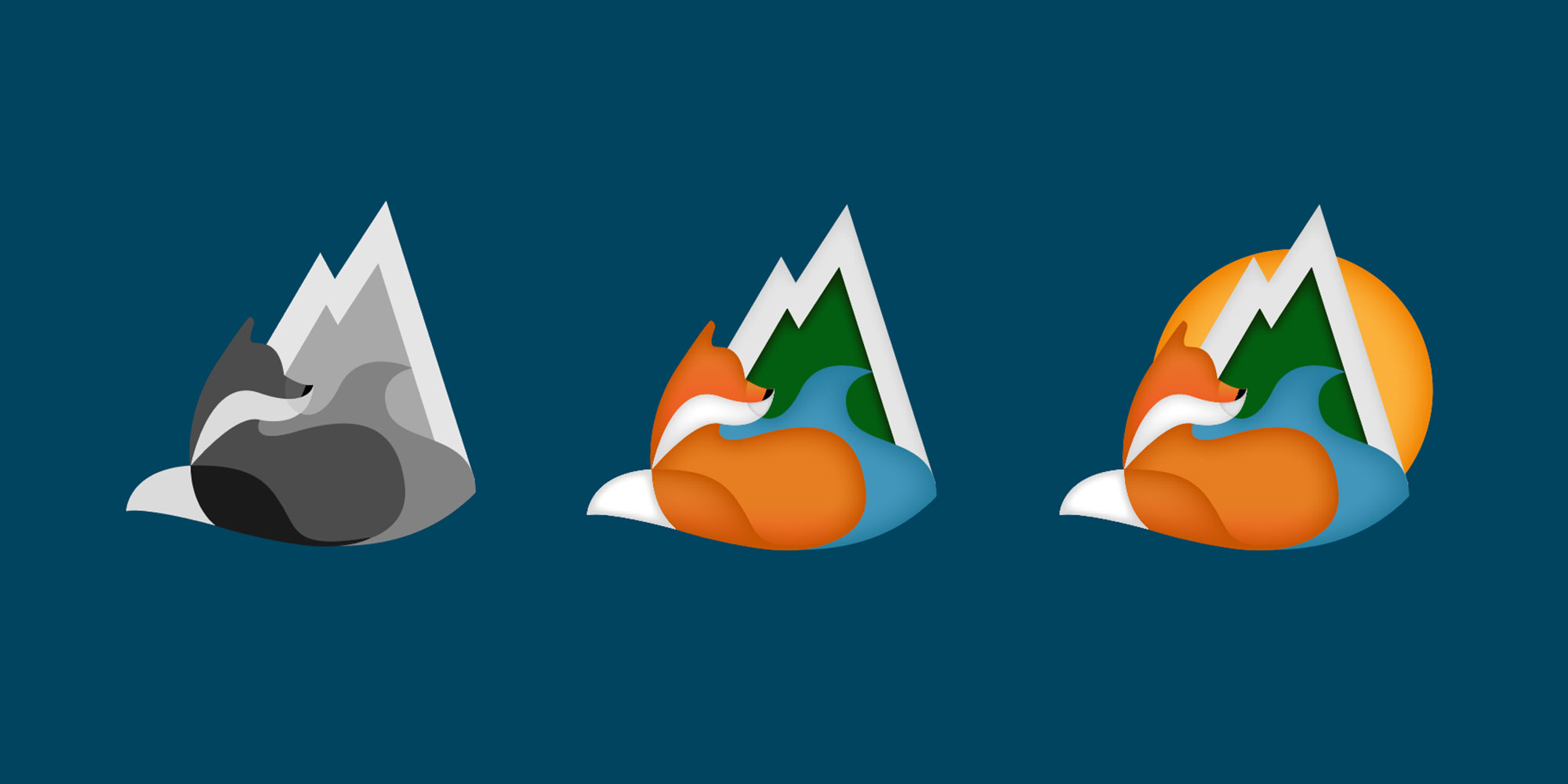
Design Thinking: The colour palette is as expected to reinforce the suggestions of mountains, water and the colourings of a fox. Shadows have been used to add depth. Below are a few iterations, from the start before colour was added, where shapes were perfected, and also a few elements removed. I found the sun added too much distraction, and was too similar to the fox. The design has been kept clean by sticking to three contrasting colours.